Friday, July 29, 2016

Should SEOs and Marketers Continue to Track and Report on Keyword Rankings? - Whiteboard Friday

Posted by randfish

Is the practice of tracking keywords truly dying? There's been a great deal of industry discussion around the topic of late, and some key points have been made. In today's Whiteboard Friday, Rand speaks to the biggest challenges keyword rank tracking faces today and how to solve for them.


Click on the whiteboard image above to open a high-resolution version in a new tab!

Video Transcription

Howdy, Moz fans, and welcome to another edition of Whiteboard Friday. This week we're going to chat about keyword ranking reports. There have been a few articles that have come out recently on a number of big industry sites around whether SEOs should still be tracking their keyword rankings.

I want to be clear: Moz has a little bit of a vested interest here. And so the question is: Can you actually trust me, who obviously I'm a big shareholder in Moz and I'm the founder, and so I care a lot about how Moz does as a software business. We help people track rankings. Does that mean I'm biased? I'm going to do my best not to be. So rather than saying you absolutely should track rankings, I'm instead going to address what most of these articles have brought up as the problems of rank tracking and then talk about some solutions by which you can do this.

My suspicion is you should probably be rank tracking. I think that if you turn it off and you don't do it, it's very hard to get a lot of the value that we need as SEOs, a lot of the intelligence. It's true there are challenges with keyword ranking reports, but not true enough to avoid doing it entirely. We still get too much value from them.

The case against - and solutions for - keyword ranking data

A. People, places, and things

So let's start with the case against keyword ranking data. First off, "keyword ranking reports are inaccurate." There's personalization, localization, and device type, and that biases and has removed what is the "one true ranking." We've done a bunch of analyses of these, and this is absolutely the case.

Personalization, turns out, doesn't change ranking that much on average. For an individual it can change rankings dramatically. If they visited your website before, they could be historically biased to you. Or if they visited your competitor's, they could be biased. Their previous search history might have biased them in a single session, those kinds of things. But with the removal of Google+ from search results, personalization is actually not as dramatically changing as it used to be. Localization, though, still huge, absolutely, and device differences, still huge.

Solution

But we can address this, and the way to do that is by tracking these things separately. So here you can see I've got a ranking report that shows me my mobile rankings versus my desktop rankings. I think this is absolutely essential. Especially if you're getting a lot of traffic from both mobile and desktop search, you need to be tracking those separately. Super smart. Of course we should do that.

We can do the same thing on the local side as well. So I can say, "Here, look. This is how I rank in Seattle. Here's how I rank in Minneapolis. Here's how I rank in the U.S. with no geographic personalization," if Google were to do that. Those types of rankings can also be pretty good.

It is true that local ranked tracking has gotten a little more challenging, but we've seen that folks like, well Moz itself, but folks like STAT (GetStat), SERPs.com, Search Metrics, they have all adjusted their rank tracking methodologies in order to have accurate local rank tracking. It's pretty good. Same with device type, pretty darn good.

B. Keyword value estimation

Another big problem that is expressed by a number of folks here is we no longer know how much traffic an individual keyword sends. Because we don't know how much an individual keyword sends, we can't really say, "What's the value of ranking for that keyword?" Therefore, why bother to even track keyword rankings?

I think this is a little bit of spurious logic. The leap there doesn't quite make sense to me. But I will say this. If you don't know which keywords are sending you traffic specifically, you still know which pages are receiving search traffic. That is reported. You can get it in your Google Analytics, your Omniture report, whatever you're using, and then you can tie that back to keyword ranking reports showing which pages are receiving traffic from which keywords.

Most all of the ranked tracking platforms, Moz included, has a report that shows you something like this. It says, "Here are the keywords that we believe are likely to have sent these percentages of traffic to this page based on the keywords that you're tracking, based on the pages that are ranking for them, and how much search traffic those pages receive."

Solution

So let's track that. We can look at pages receiving visits from search, and we can look at which keywords they rank for. Then we can tie those together, which gives us the ability to then make not only a report like this, but a report that estimates the value contributed by content and by pages rather than by individual keywords.

In a lot of ways, this is almost superior to our previous methodology of tracking by keyword. Keyword can still be estimated through AdWords, through paid search, but this can be estimated on a content basis, which means you get credit for how much value the page has created, based on all the search traffic that's flowed to it, and where that's at in your attribution lifecycle of people visiting those pages.

C. Tracking rankings and keyword relevancy

Pages often rank for keywords that they aren't specifically targeting, because Google has gotten way better with user intent. So it can be hard or even impossible to track those rankings, because we don't know what to look for.

Well, okay, I hear you. That is a challenge. This means basically what we have to do is broaden the set of keywords that we look at and deal with the fact that we're going to have to do sampling. We can't track every possible keyword, unless you have a crazy budget, in which case go talk to Rob Bucci up at STAT, and he will set you up with a huge campaign to track all your millions of keywords.

Solution

If you have a smaller budget, what you have to do is sample, and you sample by sets of keywords. Like these are my high conversion keywords - I'm going to assume I have a flower delivery business - so flower delivery and floral gifts and flower arrangements for offices. My long tail keywords, like artisan rose varieties and floral alternatives for special occasions, and my branded keywords, like Rand's Flowers or Flowers by Rand.

I can create a bunch of different buckets like this, sample the keywords that are in them, and then I can track each of these separately. Now I can see, ah, these are sets of keywords where I've generally been moving up and receiving more traffic. These are sets of keywords where I've generally been moving down. These are sets of keywords that perform better or worse on mobile or desktop, or better or worse in these geographic areas. Right now I can really start to get true intelligence from there.

Don't let your keyword targeting - your keyword targeting meaning what keywords you're targeting on which pages - determine what you rank track. Don't let it do that exclusively. Sure, go ahead and take that list and put that in there, but then also do some more expansive keyword research to find those broad sets of search terms and phrases that you should be monitoring. Now we can really solve this issue.

D. Keyword rank tracking with a purpose

This one I think is a pretty insidious problem. But for many organizations ranking reports are more of a historical artifact. We're not tracking them for a particular reason. We're tracking them because that's what we've always tracked and/or because we think we're supposed to track them. Those are terrible reasons to track things. You should be looking for reasons of real value and actionability. Let's give some examples here.

Solution

What I want you to do is identify the goals of rank tracking first, like: What do I want to solve? What would I do differently based on whether this data came back to me in one way or another?

If you don't have a great answer to that question, definitely don't bother tracking that thing. That should be the rule of all analytics.


So if your goal is to say, "Hey, I want to be able to attribute a search traffic gain or a search traffic loss to what I've done on my site or what Google has changed out there," that is crucially important. I think that's core to SEO. If you don't have that, I'm not sure how we can possibly do our jobs.

We attribute search traffic gains and losses by tracking broadly, a broad enough set of keywords, hopefully in enough buckets, to be able to get a good sample set; by tracking the pages that receive that traffic so we can see if a page goes way down in its search visits. We can look at, "Oh, what was that page ranking for? Oh, it was ranking for these keywords. Oh, they dropped." Or, "No, they didn't drop. But you know what? We looked in Google Trends, and the traffic demand for those keywords dropped," and so we know that this is a seasonality thing, or a fluctuation in demand, or those types of things.

And we can track by geography and device, so that we can say, "Hey, we lost a bunch of traffic. Oh, we're no longer mobile-friendly." That is a problem. Or, "Hey, we're tracking and, hey, we're no longer ranking in this geography. Oh, that's because these two competitors came in and they took over that market from us."


We could look at would be something like identify pages that are in need of work, but they only require a small amount of work to have a big change in traffic. So we could do things like track pages that rank on page two for given keywords. If we have a bunch of those, we can say, "Hey, maybe just a few on-page tweaks, a few links to these pages, and we could move up substantially." We had a Whiteboard Friday where we talked about how you could do that with internal linking previously and have seen some remarkable results there.

We can track keywords that rank in position four to seven on average. Those are your big wins, because if you can move up from position four, five, six, seven to one, two, three, you can double or triple your search traffic that you're receiving from keywords like that.

You should also track long tail, untargeted keywords. If you've got a long tail bucket, like we've got up here, I can then say, "Aha, I don't have a page that's even targeting any of these keywords. I should make one. I could probably rank very easily because I have an authoritative website and some good content," and that's really all you might need.


We might look at some up-and-coming competitors. I want to track who's in my space, who might be creeping up there. So I should track the most common domains that rank on page one or two across my keyword sets.

I can track specific competitors. I might say, "Hey, Joel's Flower Delivery Service looks like it's doing really well. I'm going to set them up as a competitor, and I'm going to track their rankings specifically, or I'm going to see..." You could use something like SEMrush and see specifically: What are all the keywords they rank for that you don't rank for?

This type of data, in my view, is still tremendously important to SEO, no matter what platform you're using. But if you're having these problems or if these problems are being expressed to you, now you have some solutions.

I look forward to your comments. We'll see you again next week for another edition of Whiteboard Friday. Take care.

Video transcription by Speechpad.com


Sign up for The Moz Top 10, a semimonthly mailer updating you on the top ten hottest pieces of SEO news, tips, and rad links uncovered by the Moz team. Think of it as your exclusive digest of stuff you don't have time to hunt down but want to read!

How to optimise your videos for better ranking on YouTube

With more than a billion users, and billions of daily video views, gaining user attention on YouTube may seem a daunting prospect. 


However, the sheer size of the audience (a third of all web users) means that the rewards are there if you get it right.


In this post, I'll look at some of the factors which determine YouTube video rankings, some tips to help improve visibility, and some of the factors behind how Google chooses to show videos in its search results pages.


On-site YouTube ranking factors


I've split this into visible and invisible factors, i.e. those that can be seen by general users and those used for internal purposes.


Thanks to PI Datametrics for their help in compiling these ranking factors.


Invisible ranking signals


  • Video file name. This is used when attempting to categorise the content, so be sure to label it using target keywords.

  • View density. We can all see how many views videos attract over time but view density matters to YouTube. If your video receives a lot of views in a short space of time, it's more likely to be pushed up the rankings. This can be visible, but most brands don't show this. John Lewis does, and here are the stats for the last Christmas ad.john lewis youtube

  • Meta tags. YouTube's spiders rely on tags to interpret a video's content. This is thought to be a big factor in determining the positions a video is able to achieve in YouTube. When you upload a video to YouTube you can tag it with your keywords. 6-8 tags are thought to be the ideal amount. Look at the most popular/top tags on YouTube for your topics, and learn from them.


youtube tags


  • Watch time. YouTube used to use view counts and comment volumes as factors, but changed this to watch time in 2012 as the previous factors could be gamed relatively easily.

  • Flags / reports. These are negative factors which could harm your video's visibility.


Visible ranking signals


  • Title. The maximum character limit is 100 characters. Use them well, place keywords towards the front of the title. As with a writing a good headline, titles need to be descriptive and compelling. The video should also deliver on the headline. If you over-promise, people won't spend time with the video, share it etc.

  • Description. There are 5,000 characters to play with here, but only the first (roughly) 150 will be visible to people when they land on your page, so these have to work well. This is also an opportunity to add a link back to your site or target landing page.

  • YouTube subtitles, closed captions and transcripts. These make the videos accessible to a wider audience.

  • HD videos. HD quality videos are preferred to lower picture quality ones, though this does not mean that lower quality homemade videos don't work at all.

  • In-video annotations/YouTube cards: Annotations allow you to add linkable text to a video; including notes, calls to action, and links to related video assets. This serves to build greater authority and encourages CTR, views and shares. YouTube developed 'annotations' in 2015 to include 'Cards' which are better looking version of annotations. The big difference is they work better across screens, and especially on mobile.


YT cards


  • Thumbnails. Not a ranking factor, but a well-chosen thumbnail should help to improve click through rates and increase views. The ideal size = 640 x 360 pixels minimum, 16:9 aspect ratio.

  • Likes and dislikes. These provide an indication of the engagement around a video.YT thumbs

  • Comments. These provide a way for YouTube to gauge the authority and relevance of videos. Not as significant a factor as before, perhaps because the comments on many YouTube videos are likely to test your faith in humanity.

  • View counts. Again, not as influential a factor as in the past, but still an important indication of popularity.


YouTube channel factors


A distinct YouTube channel can help give brands (or anyone) a longer term and more effective YouTube presence. There are some useful tips on this from YouTube.


  • Focus on content. Content needs to match the brand and give customers a clear indication of what to expect from your channel.

  • Keep it simple. Branding should communicate the message behind your channels, so make sure videos, channel trailers etc align with this.

  • Make it discoverable. Your branding should help people to find your videos and channel. This means consistent titles, tagging, descriptions and themes.

  • Channel views. As with video views, the channel stats will contribute towards your rankings.

  • Vanity URLs. Not a ranking factor, but something that should help improve other ranking signals by making your channel more easily discoverable.For example, Sainsbury's has https://www.youtube.com/user/Sainsburys. This helps to give the brand nice and neat results in Google:sainsburys youtube

  • Subscribes. If people have subscribed to your channel after watching your video, this indicates to YouTube as well as to Google that your video is authoritative.

  • Bookmarks. Another factor is the number of people who add your video to their 'watch later” list.


watchlist


  • Social shares. This is another factor which indicates the quality and engagement around your video.

  • Backlinks. Links back to your channel or embeds of your video carry weight, and are a further ranking factor.


Branding example: Sainsbury's


Though John Lewis is better known for its Christmas ads, rival retailer Sainsbury's manages to out-perform it in terms of YouTube visibility.


This detailed post from PI Datametrics explains in more detail, but Sainsbury's is more consistent with branding, produces more content, and seems to work harder to optimise it.


sainsbury's


Tips for improving YouTube performance


Learning from the ranking factors listed above will do a lot, but here's a few more tips:


  • Promote videos through your own channels. Using your YouTube videos in emails, promoting on social sites, and embedding on your own website will all help to build momentum around your video content.eSpares is a great example of this. It creates videos around fixing DIY problems, posts them to its YouTube channel and uses them onsite by embedding them. This way it gets full value from its video content.

  • Create video content which addresses user needs. Think about the questions customers will have around your product and service. Do some keyword research to find out the relative popularity of these terms.This is what eSpares and others do, this helps them attract views from target audiences, and a side bonus is that videos will often appear in the SERPs.espares serps

  • Encourage comments. As comments contribute to your ranking, it's a good idea to do as much as you can to encourage a discussion underneath your videos. This could be by creating content which is likely to attract comments, or simply by asking people to comment.

  • Use YouTube analytics. Data is your friend, so use it to see how your videos are performing, which are performing better than others, which attract most comments / likes etc.YT analytics


All this data can help you to learn from what does and doesn't work, and to improve the effectiveness of your video content.

Thursday, July 28, 2016

Case Study: How We Created Controversial Content That Earned Hundreds of Links

Posted by KelseyLibert

Content marketers, does the following scenario sound familiar?

You're tasked with creating content that attracts publicity, links, and social shares. You come up with great ideas for content that you're confident could accomplish these goals. However, any ideas that push the envelope or might offend anyone in the slightest get shot down by your boss or client. Even if a provocative idea gets approved, after feedback from higher-ups and several rounds of editing, you end up with a boring, watered-down version of what you originally envisioned.

Given the above, you're not surprised when you achieve lackluster results. Repeat this cycle enough times, and it may lead to the false assumption that content marketing doesn't work for the brand.

In this post, I'll answer two questions:


  1. How can I get my boss or clients to sign off on envelope-pushing content that will attract the attention needed to achieve great results?

  2. How can we minimize the risk of backlash?

Why controversy is so powerful for content marketing

To get big results, content needs to get people talking. Often times, the best way to do this is by creating an emotional reaction in the audience. Content that deals with a controversial or polarizing topic can be a surefire way to accomplish this.

On the other hand, when you play it too safe with your content, it becomes extremely difficult to ignite the emotional response needed to drive social sharing. Ultimately, you don't attract the attention needed to earn high-quality links.

Below is a peek at the promotions report from a recent controversial campaign that resulted in a lot of high-quality links, among other benefits.

abodo-promotions-report.png

Overcoming a client's aversion to controversy

We understand and respect a client's fierce dedication to protecting their brand. The thought of attaching their company to anything controversial can set off worst-case-scenario visions of an angry Internet mob and bad press (which isn't always a terrible thing).

One such example of balancing a sensitive topic while minimizing the potential risk is a recent campaign we created for apartment listing site Abodo. Our idea was to use Twitter data to pinpoint which states and cities had the highest concentration of prejudiced and tolerant tweets. Bigotry in America is an extremely sensitive topic, yet our client was open to the idea.

Want to get a contentious idea approved by your boss or client? Here's how we did it.

1. Your idea needs to be relevant to the brand, either directly or tangentially.

Controversy for the sake of controversy is not going to provide value to the brand or the target audience.

I asked Michael Taus, VP of Growth and Business Development at Abodo, why our campaign idea got the green light. He said Abodo's mission is to help people find a home, not to influence political discourse. But they also believe that when you're moving to a new community, there's more to the decision than what your house or apartment looks like, including understanding the social and cultural tone of the location.

So while the campaign dealt with a hot topic, ultimately this information would be valuable to Abodo's users.

2. Prove that playing it safe isn't working.

If your “safe” content is struggling to get attention, make the case for taking a risk. Previous campaign topics for our client had been too conservative. We knew by creating something worth talking about, we'd see greater results.

3. Put safeguards in place for minimizing risk to the brand.

While we couldn't guarantee there wouldn't be a negative response once the campaign launched, we could guarantee that we'd do everything in our power to minimize any potential backlash. We were confident in our ability to protect our client because we'd done it so many times with other campaigns. I'll walk you through how to do this throughout the rest of the post.

On the client's end, they can get approval from other internal departments; for example, having the legal and PR teams review and give final approval can help mitigate the uncertainty around running a controversial campaign.

Did taking a risk pay off?

The campaign was a big success, with results including:


  • More than 620 placements (240 dofollow links and 280 co-citation links)

  • Features on high-authority sites including CNET, Slate, Business Insider, AOL, Yahoo, Mic, The Daily Beast, and Adweek

  • More than 67,000 social shares

  • A whole lot of discussion

cnet-coverage.png

Beyond these metrics, Abodo has seen additional benefits such as partnership opportunities. Since this campaign launched, they were approached by a nonprofit organization to collaborate on a similar type of piece. They hope to repeat their success by leveraging the nonprofit's substantial audience and PR capabilities.

Essential tips for minimizing risk around contentious content

We find that good journalism practices can greatly reduce the risk of a negative response. Keep the following five things in mind when creating attention-grabbing content.

1. Presenting data vs. taking a stance: Let the data speak

Rather than presenting an opinion, just present the facts. Our clients are usually fine with controversial topics as long as we don't take a stance on them and instead allow the data we've collected to tell the story for us. Facts are facts, and that's all your content needs to offer.

If publishers want to put their own spin on the facts you present or audiences see the story the data are telling and want to respond, the conversation can be opened up and generate a lot of engagement.

For the Abodo campaign, the data we presented weren't a direct reflection of our client but rather came from an outside source (Twitter). We packaged the campaign on a landing page on the client's site, which includes the design assets and an objective summary of the data.

abodo-landing-page.png

The publishers then chose how to cover the data we provided, and the discussion took off from there. For example, Slate called out Louisiana's unfortunate achievement of having the most derogatory tweets.

slate-coverage.png

2. Present more than one side of the story

How do you feel when you watch a news report or documentary that only shares one side of the story? It takes away credibility from the reporting, doesn't it?

To keep the campaign topic from being too negative and one-sided, we looked at the most prejudiced and least prejudiced tweets. Including states and cities with the least derogatory tweets added a positive angle to the story. This made the data more objective, which improved the campaign's credibility.

least-derogatory.png

Regional publishers showed off that their state had the nicest tweets.

idaho-article.png

And residents of these places were proud to share the news.

If your campaign topic is negative, try to show the positive side of it too. This keeps the content from being a total downer, which is important for social sharing since people usually want to pass along content that will make others feel good. Our recent study on the emotions behind viral content found that even when viral content evokes negative emotions, it's usually not purely negative; the content also makes the audience feel a positive emotion or surprise.

Aside from objective reporting, a huge benefit to telling more than one side of the story is that you're able to pitch the story for multiple angles, thus maximizing your potential coverage. Because of this, we ended up creating 18 visual assets for this campaign, which is far more than we typically do.

3. Don't go in with an agenda

Be careful of twisting the data to fit your agenda. It's okay to have a thesis when you start, but if your aim is to tell a certain story you're apt to stick with that storyline regardless of what the data show. If your information is clearly slanted to show the story you want to tell, the audience will catch on, and you'll get called out.

Instead of gathering research with an intent of "I'm setting out to prove XYZ," adopt a mindset of "I wonder what the reality is."

4. Be transparent about your methodology

You don't want the validity of your data to become a point of contention among publishers and readers. This goes for any data-heavy campaign but especially for controversial data.

To combat any doubts around where the information came from or how the data were collected and analyzed, we publish a detailed methodology alongside all of our campaigns. For the Abodo campaign, we created a PDF document of the research methodology which we could easily share with publishers.

methodology-example.pngInclude the following in your campaign's methodology:


  • Where and when you received your data.

  • What kind and how much data you collected. (Our methodology went on to list exactly which terms we searched for on Twitter.)

  • Any exceptions within your collection and analysis, such as omitted information.

  • A list of additional sources. (We only use reputable, new sources ideally published within the last year.)

sources-example.png

For even more transparency, make your raw data available. This gives publishers a chance to comb through the data to find additional story angles.

5. Don't feed the trolls

This is true for any content campaign, but it's especially important to have an error-free campaign when dealing with a sensitive topic since it may be under more scrutiny. Don't let mistakes in the content become the real controversy.

Build multiple phases of editing into your production process to ensure you're not releasing inaccurate or low-quality content. Keep these processes consistent by creating a set of editorial guidelines that everyone involved can follow.

We put our campaigns through fact checking and several rounds of quality assurance.

Fact checking should play a complementary role to research and involves verifying accuracy by making sure all data and assertions are true. Every point in the content should have a source that can be verified. Writers should be familiar with best practices for making their work easy to fact-check; this fact-checking guide from Poynter is a good resource.

Quality assurance looks at both the textual and design elements of a campaign to ensure a good user experience. Our QA team reviews things like grammar, clarity (Is this text clearly making a point? Is a design element confusing or hard to read?), and layout/organization.

Include other share-worthy elements

Although the controversial subject matter helped this campaign gain attention, we also incorporated other proven elements of highly shareable content:


  • Geographic angle. People wanted to see how their state or city ranked. Many took to social media to express their disappointment or pride in the results.

  • Timeliness. Bigotry is a hot-button issue in the U.S. right now amidst racial tension and a heated political situation.

  • Comparison. Rankings and comparisons stimulate discussion, especially when people have strong opinions about the rankings.

  • Surprising. The results were somewhat shocking since some cities and states which ranked “most PC” or “most prejudiced” were unexpected.

The more share-worthy elements you can tack onto your content, the greater your chances for success.

Have you seen success with controversial or polarizing content? Did you overcome a client's objection to controversy? Be sure to share your experience in the comments.


Sign up for The Moz Top 10, a semimonthly mailer updating you on the top ten hottest pieces of SEO news, tips, and rad links uncovered by the Moz team. Think of it as your exclusive digest of stuff you don't have time to hunt down but want to read!

Facebook image cheat sheet: maximum photo sizes for your branded page and ads

Our previously published guide to Facebook image sizes is well over two years-old and therefore long overdue for an update, and SO much has happened to the world's most popular social network (for now) since then…


However, as Larry Kim taught us this week in his post on how to improve organic Facebook reach, it is still possible to find your audience without having to break the bank.


This guide is designed to ensure that when Facebook users do see and interact with your brand, that you're all scrubbed up and as presentable as you possibly can be.


These are the correct dimensions, resolutions and features you need for optimising your Facebook channel, without the need of an overzealous parent spitting in a handkerchief and scrubbing your face till it's red.


In order to do this as accurately and up-to-date as possible (seeing as Facebook only just recently changed the layout of branded pages again) I'll be using examples from the FB Pages Sizes and Dimensions page from Yoconda. It's worth giving them a like to keep up-to-date. And I'll be using the helpful advice from Miranda Miller in her original guide.


Facebook page


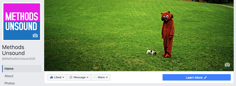
The top of your Facebook page as of July 2016 will now look something like this…


methods unsound fb page


Let's break down the measurements…


Facebook header image


fb header image


The optimal image size for your header image is 851 x 315 pixels. Any less and you'll lose resolution. Start with a canvas of double that size – 1702 x 630 – for sharp, crisp images; Facebook will resize it and you'll have the right dimensions.


The mobile safe area is 563 x 315 pixels.


Follow these dos and don'ts of header images:


  • Do use a unique image to represent your page.

  • Do experiment with different images to see which gets the best response.

  • Do change up your image to highlight special events, seasonal trends, or other types of campaigns.

  • Don't include any content that may be deceptive, misleading, infringe on anyone else's copyright, or violate Facebook's Pages Terms.

  • Don't encourage people to upload your cover image to their personal Timeline.

  • Don't make more than 20% of your cover image text.

  • To get the fastest load times for your Page, upload an sRGB JPG file that's less than 100 kilobytes.

  • For images with your logo or text content, you may get a higher quality result by using a PNG file.


Facebook profile picture


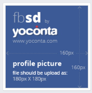
Your profile picture will be displayed at 160 x 160 pixels but must be at least 180 x 180 pixels to upload.


Pictures of different dimensions can be cropped upon uploading.


fb profile picture


Also note that the profile picture no longer partially obscures the header image like it used to, so you can no longer do those 'fun and amusing' combinations


Your profile picture appears around Facebook wherever you interact with users and in their Newsfeed at 90 x 90 pixels so your profile picture must be legible at this resolution.


Shared link image


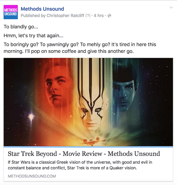
The image that's automatically pulled in from a link you've shared, or the one you'v uploaded an alternative image from your desktop will appear on your timeline and in the Newsfeed as 476 x 249 pixels.


Shared link image


Facebook ads


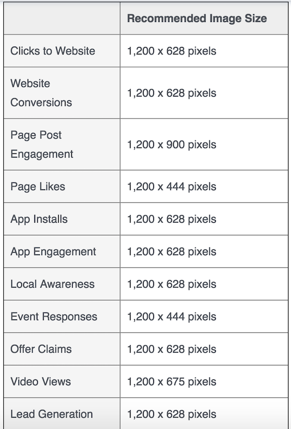
According to the Facebook business help page, different ad objectives recommend different Facebook ad sizes. If you'd like your Facebook ads to be eligible to show in all of the different formats, including desktop News Feed, mobile News Feed and the right column, then you should use the recommended ad image sizes:


facebook ad sizes


Also note that if your image is larger or smaller than the dimensions specified it willl be automatically resized to fit in the ad. Animated or flash images aren't supported.


Facebook Ads images also have their own set of rules:


  • Must be relevant and appropriate to the advertised product.

  • May not exploit political, sexual or other sensitive issues.

  • May not be overly sexual, imply nudity, show excessive amounts of skin or cleavage, or focus unnecessarily on body parts.

  • May not portray nonexistent functionality, including but not limited to play buttons that suggest video capability and close buttons that do not close.

  • May not contain QR codes.

  • May not use Facebook brand images without permission, including but not limited to logos, icons and alert notification graphics.

  • Images targeted to users under 18 must be appropriate for that age group.

  • May not include images made up of more than 20% text, including logos and slogans. Note: this does not apply to pictures of products that include text on the actual product. Photos of products in real situations or photos of products with a background are acceptable. Images that are zoomed in on logos or images with text overlay are not allowed.


Facebook photo albums


Photo album cover thumbnails appear as 175 x 175 pixels.


175 x 175

When you click into an album, the image previews are 201 x 201 pixels.

201 x 201


Full size images are 660 x 440 pixels. However the maximum image size for uploading to your company albums or timeline is 2048 x 2048 pixels.


660 x 440

Wednesday, July 27, 2016

Should you use a hamburger icon on your mobile menu?

The three-line 'hamburger' menu icon receives a lot of vitriol. It is variously described as “controversial”, “notorious” etc. but it is rapidly becoming the de facto symbol to open a navigational menu on a mobile website.


So perhaps it is time to learn to live with it and make it better.


The hamburger was created in 1980 by Norm Cox, for the Xerox “Star” personal workstation, the world's first graphical user interface.


Norm Cox, principal of interaction/experience design consultancy, Cox&Hall, tells ClickZ:


“Since someone “discovered”, a few years ago, that I had designed the hamburger menu, I've had countless questions, speaking invitations, interviews and inquiries… and read numerous articles and blogs regarding the (somewhat fabricated) controversy over its use.


In a way, I find it amusing that a simple widget like this has gotten so much attention, generated so much discussion, and gotten so many “experts” bloviating about the reasoning for its good/bad or right/wrong attributes.


I will simply say this about the hamburger widget. It is merely another widget in a designer's arsenal of tools that s/he can use… well… or poorly. It has no inherent goodness/badness, or rightness/wrongness, except in the context of how it's applied by the designer.”


This column will look at mobile menu best practice, including:


  • How to make the hamburger icon more recognizable, e.g. by adding or substituting the word MENU.

  • Supplementing, or replacing the hamburger menu, with visible navigational tabs and buttons.

  • Research that suggests what works better.

  • Importance of doing your own user testing and A/B testing.


The subsequent column will look more closely at the design and user experience (UX) aspects, including:


  • Making the menu and navigational buttons standout. Type, size, color and placement of buttons.

  • Navigational discipline; taking a logical approach to size, number and names of menu items.

  • Different types of mobile menu, such as off-canvas and overlay.


The image below shows the mobile sites for top six search results for “hamburger icon” on the world's most popular search engine. Five out of six of these headlines appear on sites that use a site-wide hamburger icon.


Three stories are negative. Two of negative stories: the BBC's “Three lines mystify most people” and TechCrunch's “Kill the hamburger button” sit, somewhat embarrassingly, below a hamburger.


Not only have the TechCrunch/AOL developers ignored the recommendations of its writers on the “devil” hamburger on mobile web (and app) they have also introduced a second unlabeled icon – a rocket – to denote a hidden menu of 'most popular' stories.


hamburger_menu_collection_cz26


Menu/hamburger on mobile web, iOS apps and Android apps is different.


Critics of the hamburger icon report (and re-report) a number of internal studies by companies that noticed a deterioration in use of the menu when they switched the menu style used by their apps or website to a hamburger icon and vice versa when switching away.


Only one of these studies is mobile web:


  • James Foster (2014) discovered through A/B testing on found that 20% more mobile visitors to Caffeineinformer.com  would click the “MENU”, over “hamburger icon”.

  • However, on closer inspection, the menu click-through rates on Caffeineinformer seem unusually low (see Moovweb stats below for benchmarks). The click-through rates of 1.2% for “MENU” and 1% for the “hamburger icon”. This suggests that the test should be hidden menu v visible navigational links, e.g. search database, rather than the nomenclature of the menu button itself.

  • Today, Caffeineinformer.com doesn't use MENU or Hamburger on the homepage, just search and the call to action: Explore Caffeine Database. On all other pages it uses MENU and a search icon.


caffeine_informer_home_cz26


The other studies commonly cited are for native apps (maybe just iOS): Zeebox (2014); Polar (2015), and Redbooth (2015). These studies suggested that menus hidden behind a hamburger icon received less engagement than visible navigational tabs.


Notably, Redbooth was an iOS app study; Zeebox and Polar may also have been, but neither app exists anymore.


So while these native app studies appear to be compelling, it does not follow that the behavior of iOS app users is applicable to mobile web. Nor does it follow that it applies to Android apps either.


As Redbooth notes: “Apple discourages [the hamburger's] use”, and Zeebox notes: “The side menu has become fashionable on Android but not yet taken off on iPhone”.


The importance of doing your own tests


However compelling other people's findings about their own sites/apps appear, they should not dictate how you design/redesign you website.


As demonstrated below in the Moovweb research, engagement levels of the hamburger/menu vary massively by industry.


The key lesson to learn is not that the hamburger is good or bad, or that hidden menus are good or bad, but that it is important to run your own tests.


  • Conduct user tests: onsite and remote.

  • Use A/B testing – show two different groups of web visitors different versions of your menu e.g. hamburger v MENU. (The beauty of web over apps, is that you don't need anyone's permission to test and modify).

  • Use heatmaps – to study how people interact with menus and navigation.


Learn more about mobile user testing.


The truth about Facebook and the hamburger icon.


Critics of the hamburger also like to cite Facebook's 2013 decision to drop the hamburger icon in favor of a bottom tab bar as vindication.


Reality:


  • This change only happened on the iOS app.

  • The hamburger is still present on the iOS app on the bottom tab bar, albeit embellished with a MORE label.

  • Three years later the m.facebook.com and the Facebook Android app still proudly sport the unlabeled hamburger icon.

  • What does that tell you? a) Native iOS is different to mobile web and native Android; or b) The results of the changes on iOS didn't encourage Facebook to follow up with either mobile web or Android.


facebook_web_android_iOS_cz26


Proper research 


Despite the immense importance of navigation on the mobile/responsive web, lack of conformity and the bitter debate that the hamburger encourages among design/UX professionals, it is amazing that there haven't been more studies of menu use across multiple sites.


While not massive, there are two studies that are essential reading:


Good burger/bad burger  


Moovweb studied 50 sites that used its mobile/responsive commerce platform and made two interesting findings:


  1. 20% of mobile site users interact with the hamburger menu, making it the fourth most tapped button on site, behind select product (30%); homepage navigational menu (30%); and search (27%).

  2. Hamburger menu engagement varied massively by vertical: apparel and accessories (26%); jewelry (21%); home & garden (21%); auto & construction (7%); content (2%).


moovweb_hamburger_engage_cz26


Then working with one unnamed mobile travel site, Moovweb ran a test to compare engagement rate with an unlabeled hamburger icon and one that was labeled.


The results were striking. The engagement rate for the unlabeled menu icon was 10.8%; while labeled one received 17.3%; which is a 61% improvement.


Hamburger + MENU or MENU – hamburger?


While adding a MENU is the most common label to enhance the hamburger, there are variations, as seen above the BBC uses a SECTIONS label, while Facebook (only on the iOS app) uses MORE.


The question is: if you are going to add MENU to your hamburger icon, then why bother with the hamburger at all?


Jason Grigsby, co-founder, of Portland, Oregon-based mobile web development agency, Cloud Four, tells ClickZ.


“When people criticize the hamburger, e.g.Luke Wroblewski, they're referring to the fact that the icon itself doesn't convey enough meaning. People get confused by it.


So the argument is to avoid using the hamburger icon and instead use the word 'menu' or similar so people know what the hell you're going on about.”


The new design of the Cloud Four site uses a MENU button, with a menu that slides down from the top.


The navigation menu, as Grigsby points out, is a whole different matter… and one we will be dealing with in detail in the next column.


cloud_four_homepage_menu_cz26


Hidden menus: nice clean design or “out of sight, out of mind”?


To hamburger or not to hamburger… is only part of the question.


The other side of this debate concerns the whole nature of the menu, the fact that all the options are invisible unless the user taps the hamburger icon/menu button.


The clever thing that Luke Wroblewski pointed out is “out of sight, out of mind. This has become a rallying cry again the hidden menu and the poor old hamburger icon that has come to symbolize the hidden menu.


To date evidence to prove this theory is largely anecdotal, and based on apps such as Zeebox, Redbooth and Polar, (Wroblewski being one of these developers).


That's what makes the recent Nielsen Norman Group/WhatUsersDo research so welcome: it's web based, spread over six sites, with real users (179 of them), and its real research conducted by expert UX testers.


The research asked people to complete a task on the various responsive sites on desktop and mobile and studied whether people engaged better with/found it easy with:


  • Hidden navigation – where they had to tap a hamburger or equivalent)

  • Combo navigation – combination of hidden menu a visible navigational buttons, when required to.

  • Visible navigation – only desktop sites; no mobile sites with visible navigation (only) were tested, which is a shame.


The key findings for mobile users were:


  • People used menus considerably more on mobile than desktops

  • People were 1.5 times more likely to use combo navigation (86%) than hidden (57%).

  • More found it easier to discover content that interested them with combo (85%) than hidden (64%)

  • Task took longer with hidden (70 seconds), than combo (61 seconds).


nng_hamburger_menus


Nielsen Norman makes the following recommendations for mobile sites:


  • If your site has four or fewer top-level navigation links, display them as visible links.

  • If your site has more than four top-level navigation links, the only reasonable solution is to hide some of these [behind a menu button].

  • Support the hamburger with methods such as in-page links to important information on your site.


Combo approach


Returning to the image above of the top six top ranking sites for “hamburger icon”. Three out of five that use a hamburger, use the unlabeled icon alone for navigation and one (TechCrunch) even uses an additional unlabeled rocket.


The BBC is the only one that adopts a combo approach to navigation. It has visible tabs for NEWS, SPORT and MORE (which is a menu) in addition to the Hamburger/Sections button.


Interestingly on older/smaller smartphone these three options are reduced to one MENU button.


A great example of the combo is Summit Metro Parks, which uses a labelled hamburger menu and four labelled buttons for key activities.


Mike D'Agruma, lead front-end developer, Evolve Creative Group, a web design agency in Akron, OH, USA, explains why he likes the Summit Metro Parks site.


“The hamburger/menu icon is at the top of the home screen. It has clear visual separation via color, size and treatment from surrounding content. Not only does it use of iconography, but includes a text descriptions. There is no assumption about that the user will recognize and know how to use the icon.


There are additional types of navigation competing for attention on the page. As well as the hamburger/MENU, there is a rotator/carousel with a clear call-to-action on each slide to help funnel users where the site wants them to go. Then there is a second-tier page navigation of highly visible and labelled buttons.”


The science of navigation


A really useful way to think about menus and navigation is to stop worrying about them and start thinking about what users actually want to do and make it really easy for people to do it.


If people are on a certain page there is a strong probability that they will want to do a finite number of things next. If these are not on the page, put them on visible call-to-action buttons, image links, text links etc.


Things that people might want to do, but are lower down the hierarchy of probable tasks can be placed in the menu.


The expert on this is Steven Hoober, president of 4ourth Mobile, who is recognized for his work on mobile touch-screen interfaces. He explains:


“The important thing is to stop thinking about navigation and site structure and think about what the user wants to do. They have priorities, which I call primary, secondary and tertiary actions:


  • The primary actions should be addressed by the content in the center section of the page.

  • The secondary actions are the thing that the user is most likely to want to do next. These should be addressed by visible and easily reached call-to-action buttons on the periphery of the page on the top navigation or adjacent to the primary content.

  • The tertiary actions are the other things that users might want, but are less likely to be priorities. This is where your hamburger menu comes in.”


Hoober's article on Why it's totally okay to use a hamburger icon  is essential reading.


The hamburger and the hamburger debate is here to stay.


Some people will continue to hate it. This from Nick Babich, editor of UX planet: https://uxplanet.org/


To my mind, Hamburger is a bad option both for mobile and for desktop.”


And some will defend it. Phil Reay, head of insights, SessionCam, a tool for monitoring web customer behavior:


“Until a better solution to the hamburger menu is designed, our experience suggests that this catch all approach provides the best user experience for customers.”


The next column will look more closely at the design and user experience (UX) aspects of menus and navigation.


Read the report here: DNA of a Great M-Commerce Site Part 1: Planning

Tuesday, July 26, 2016

17 useful search marketing stats from Merkle's Q2 2016 report

This morning, Merkle released their quarterly Direct Marketing Report, ahead of Google's own Q2 earnings announcement and it makes for a bumper stat-filled reading.


Of particular note are the revelations that:


  • Google search spending growth has slowed to 22% as CPCs fall 9%

  • Desktop PLA growth rate jumps while mobile growth is strong but slowing

  • Shopping Ads traffic from Google image search and Yahoo surges

  • Google's expanded text ads have had only a modest impact


The report covers the latest trends in paid search, organic search, social media, display advertising, and comparison shopping engines, so let's cherry-pick some of the highlights…


Paid Search


  • Advertiser spending on Google paid search grew 22% Y/Y in Q2 2016, a slight deceleration from 25% growth in Q1.

  • Click growth increased slightly to 34%, but CPCs fell 9%.

  • Spending growth for Google text ads slowed to 10% Y/Y as CPC growth for brand keywords fell from 10% in Q1 to 0% in Q2.

  • Google Shopping Ad spending growth rose to 43% as an influx of partner traffic bolstered total click volume.

  • Combined spending on Bing Ads and Yahoo Gemini search ads fell 17% Y/Y as click declines continued to worsen.

  • Bing Product Ad spending fell for the first time since the format's launch, likely the result of Yahoo moving to show more Google PLAs.

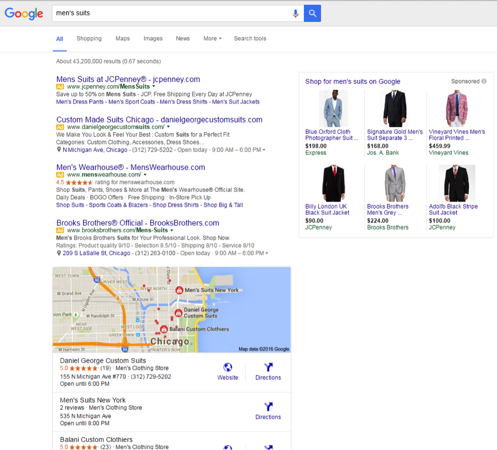
  • Phones and tablets produced 53% of all paid search clicks in Q2, the same rate as a quarter earlier, but up 12 points from a year earlier. Google's share of clicks from mobile increased slightly to just over 57%


mens suits serp


Organic Search & Social


  • Organic search visits fell 7% Y/Y in Q2, down from 11% Y/Y growth a year earlier, as organic listings face increased competition from paid search ads, particularly on mobile.

  • Mobile's share of organic search visits rose to 46%, but that still lags behind the 53% of paid search clicks that mobile produces, as well as the 47% share that mobile produced for organic search a year ago.

  • Google produced 86% of all organic search visits in the US and 90% of mobile organic search visits.

  • Google's share of mobile organic search has increased by nearly two points in the past year.

  • Social media sites accounted for 2.8% of site visits in Q2 2016, with Facebook producing 63% of all site visits driven by social media.


Comparison Shopping Engines


  • The eBay Commerce Network commanded a majority of advertisers' comparison shopping engine (CSE) spending for the first time in Q2. Along with Connexity, the two dominant CSE platforms accounted for 97% of all CSE ad spending.

  • Advertiser revenue produced by eBay Commerce Network and Connexity listings grew by 33% and 23% Y/Y respectively; however, the two platforms combined for less than 10% of the revenue produced by Google Shopping Ads, among advertisers participating in all three platforms.


Display Advertising


  • Total display advertising spending grew 62% Y/Y, driven by very strong results from Facebook, where Merkle advertisers increased their investment by 121% Y/Y.

  • Retargeting accounted for 62% of all display spending in Q2.

  • The Google Display Network (GDN) also delivered spending growth, with advertisers seeing its share of total Google ad spending increase to 12%.

Ranking #0: SEO for Answers

Posted by Dr-Pete

It's been over two years since Google launched Featured Snippets, and yet many search marketers still see them as little more than a novelty. If you're not convinced by now that Featured Snippets offer a significant organic opportunity, then today is my attempt to change your mind.

If you somehow haven't encountered a Featured Snippet searching Google over the past two years, here's an example (from a search for "ssl"):


This is a promoted organic result, appearing above the traditional #1 ranking position. At minimum, Featured Snippets contain an extracted answer (more on that later), a display title, and a URL. They may also have an image, bulleted lists, and simple tables.

Why should you care?

We're all busy, and Google has made so many changes in the past couple of years that it can be hard to sort out what's really important to your customer or employer. I get it, and I'm not judging you. So, let's get the hard question out of the way: Why are Featured Snippets important?

(1) They occupy the "#0" position

Here's the top portion of a SERP for "hdmi cable," a commercial query:


There are a couple of interesting things going on here. First, Featured Snippets always (for now) come before traditional organic results. This is why I have taken to calling them the "#0" ranking position. What beats #1? You can see where I'm going with this... #0. In this case, the first organic is pushed down even more, below a set of Related Questions (the "People also ask" box). So, the "#1" organic position is really third in this example.

In addition, notice that the "#0" (that's the last time I'll put it in quotes) position is the same URL as the #1 organic position. So, Amazon is getting two listings on this result for a single page. The Featured Snippet doesn't always come from the #1 organic result (we'll get to that in a minute), but if you score #0, you are always listed twice on page one of results.

(2) They're surprisingly prevalent

In our 10,000-keyword tracking data set, Featured Snippets rolled out at approximately 2% of the queries we track. As of mid-July, they appear on roughly 11% of the keywords we monitor. We don't have good historical data from the first few months after roll-out, but here's a 12-month graph (July 2015 – July 2016):


Featured Snippets have more than doubled in prevalence in the past year, and they've increased by a factor of roughly 5X since launch. After two years, it's clear that this is no longer a short-term or small-scale test. Google considers this experiment to be a success.

(3) They often boost CTR

When Featured Snippets launched, SEOs were naturally concerned that, by extracting and displaying answers, click-through rates to the source site would suffer. While extracting answers from sites was certainly uncharted territory for Google, and we can debate their use of our content in this form, there's a growing body of evidence to suggest that Featured Snippets not only haven't harmed CTR, but they actually boost it in some cases.

In August of 2015, Search Engine Land published a case study by Glenn Gabe that tracked the loss of a Featured Snippet for a client on a competitive keyword. In the two-week period following the loss, that client lost over 39K clicks. In February of 2016, HubSpot did a larger study of high-volume keywords showing that ranking #0 produced a 114% CTR boost, even when they already held the #1 organic position. While these results are anecdotal and may not apply to everyone, evidence continues to suggest that Featured Snippets can boost organic search traffic in many cases.

Where do they come from?

Featured Snippets were born out of a problem that dates back to the early days of search. Pre-Google, many search players, including Yahoo, were human-curated directories first. As content creation exploded, humans could no longer keep up, especially in anything close to real-time, and search engines turned to algorithmic approaches and machine curation.

When Google launched the Knowledge Graph, it was based entirely on human-curated data, such as Freebase and Wikidata. You can see this data in traditional "Knowledge Cards," sometimes generically called "answer boxes." For example, this card appears on a search for "Who is the CEO of Tesla?":


The answer is short and factual, and there is no corresponding source link for it. This comes directly from the curated Knowledge Graph. If you run a search for "Tesla," you can see this more easily in the Knowledge Panel on that page:


In the middle, you can see an entry for "CEO: Elon Musk." This isn't just a block of display text - each of these line items are factoids that exist individually as structured data in the Knowledge Graph. You can test this by running searches against other factoids, like "When was Tesla founded?"

While Google does a decent job of matching many forms of a question to answers in the Knowledge Graph, they can't escape the limits of human curation. There are also questions that don't easily fit the "factoid" model. For example, if you search "What is ludicrous mode Tesla?" (pardon the weird syntax), you get this Featured Snippet:


Google's solution was obvious, if incredibly difficult - take the trillions of pages in their index and use them to generate answers in real-time. So, that's exactly what they did. If you go to the source page on Engadget, the text in the Featured Snippet is taken directly from on-page copy (I've added the green highlighting):


It's not as simple as just scraping off the first paragraph with a spatula and flipping it onto the SERP, though. Google does seem to be parsing content fairly deeply for relevance, and they've been improving their capabilities constantly since the launch of Featured Snippets. Consider a couple of other examples with slightly different formats. Here's a Featured Snippet for "How much is a Tesla?":


Note the tabular data. This data is being extracted and reformatted from a table on the target page. This isn't structured data - it's plain-old HTML. Google has not only parsed the table but determined that tabular data is a sensible format in response to the question. Here's the original table:


Here's one of my favorite examples, from a search for "how to cook bacon." For any aspiring bacon wizards, please pay careful attention to step #4:


Note the bulleted (ordered) list. As with the table, not only has Google determined that a list is a relevant format for the answer, but they've created this list. Now look at the target page:


There's no HTML ordered list (

    ) on this page. Google is taking a list-like paragraph style and converting it into a simpler list. This content is also fairly deep into a long page of text. Again, there is no structured data in play. Google is using any and all content available in the quest for answers.

    How do you get one?

    So, let's get to the tactical question - how can you score a Featured Snippet? You need to know two things. First, you have to rank organically on the first page of results. Every Featured Snippet we've tracked also ranks on page one. Second, you need to have content that effectively targets the question.

    Do you have to rank #1 to get the #0 position? No. Ranking #1 certainly doesn't hurt, but we've found examples of Featured Snippet URLs from across all of page one. As of June, the graph below represents the distribution of organic rankings for all of the Featured Snippets in our tracking data set:


    Just about 1/3 of Featured Snippets are pulled from the #1 position, with the bulk of the remaining coming from positions #2–#5. There are opportunties across all of page one, in theory, but searches where you rank in the top five are going to be your best targets. The team at STAT produced an in-depth white paper on Featured Snippets across a very large data set that showed a similar pattern, with about 30% of Featured Snippet URLs ranking in the #1 organic position.

    If you're not convinced yet, here's another argument for the "Why should you care?" column. Once you're ranking on page one, our data suggests that getting the Featured Snippet is more about relevance than ranking/authority. If you're ranking #2–#5 it may be easier to compete for position #0 than it is for position #1. Featured Snippets are the closest thing to an SEO shortcut you're likely to get in 2016.

    The double-edged sword of Featured Snippets (for Google) is that, since the content comes from our websites, we ultimately control it. I showed in a previous post how we fixed a Featured Snippet with updated data, but let's get to what you really want to hear - can we take a Featured Snippet from a competitor?

    A while back, I did a search for "What is Page Authority?" Page Authority is a metric created by us here at Moz, and so naturally we have a vested interest in who's ranking for that term. I came across the following Featured Snippet.


    At the time, DrumbeatMarketing.net was ranking #2 and Moz was ranking #1, so we knew we had an opportunity. They were clearly doing something right, and we tried to learn from it. Their page title addressed the question directly. They jumped quickly to a concise answer, whereas we rambled a little bit. So, we rewrote the page, starting with a clear definition and question-targeted header:


    This wasn't the only change, but I think it's important to structure your answers for brevity, or at least summarize them somewhere on the page. A general format of a quick summary at the top, followed by a deeper dive seems to be effective. Journalists sometimes call this an "inverted pyramid" structure, and it's useful for readers as well, especially Internet readers who tend to skim articles.


    In very short order, our changes had the desired impact, and we took the #0 position:


    This didn't take more authority, deep structural changes, or a long-term social media campaign. We simply wrote a better answer. I believe we also did a service to search users. This is a better page for people in a hurry and leads to a better search snippet than before. Don't think of this as optimizing for Featured Snippets, or you're going to over-optimize and be haunted by the Ghost of SEO Past. Think of it as being a better answer.


    What should you target?

    Featured Snippets can require a slightly different and broader approach to keyword research, especially since many of us don't routinely track questions. So, what kind of questions tend to trigger Featured Snippets? It's helpful to keep in mind the 5 Ws (Who, What, When, Where, Why) + How, but many of these questions will generate answers from the Knowledge Graph directly.

    To keep things simple, ask yourself this: is the answer a matter of simple fact (or a "factoid")? For example, a question like "How old is Beyoncé?" or "When is Labor Day?" is going to be pulled from the Knowledge Graph. While human curation can't keep up with the pace of the web, WikiData and other sources are still impressive and cover a massive amount of territory. Typically, these questions won't produce Featured Snippets.

    What and implied-what questions

    A good starting point is "What...?" questions, such as our "What is Page Authority?" experiment. This is especially effective for industry terms and other specialized knowledge that can't be easily reduced to a dictionary definition.

    Keep in mind that many Featured Snippets appear on implied "What..." questions. In other words, "What" never appears in the query. For example, here's a Featured Snippet for "PPC":


    Google has essentially decided that this fairly ambiguous query deserves an answer to "What is PPC?" In other words, they've implied the "What." This is fairly common now for industry terms and phrases that might be unfamiliar to the average searcher, and is a good starting point for your keyword research.

    Keep in mind that common words will produce a dictionary entry. For example, here's a Knowledge Card for "What is search?":


    These dictionary cards are driven by human-curated data sources and are not organic, in the typical sense of the word. Google has expanded dictionary results in the past year, so you'll need to focus on less common terms and phrases.

    Why and how questions

    "Why... ?" questions are good fodder for Featured Snippets because they can't easily be answered with factoids. They often require some explanation, such as this snippet for "Why is the sky blue?":


    Likewise, "How...?" questions often require more in-depth answers. An especially good target for Featured Snippets is "How to... ?" questions, which tend to have practical answers that can be summarized. Here's one for "How to make tacos":


    One benefit of "Why," "How," and "How to" questions is that the Featured Snippet summary often just serves as a teaser to a longer answer. The summary can add credibility to your listing while still attracting clicks to in-depth content. "How... ?" may also be implied in some cases. For example, a search for "convert PDF to Word" brings up a Featured Snippet for a "How to..." page.

    What content is eligible?

    Once you have a question in mind, and that question/query is eligible for Featured Snippets, there's another piece of the targeting problem: which page on your site is best equipped to answer that question? Let's take, for example, the search "What is SEO?". It has the following Featured Snippet from Wikipedia:


    Moz ranks on page one for that search, but it still begs two questions: (1) is the ranking page the best answer to the question (in Google's eyes), and (2) what content on the page do they see as best matching the question. Fortunately, you can use the "site:" operator along with your search term to help answer both questions. Here's a Featured Snippet for [site:moz.com "what is seo"]:


    Now, we know that, within just our own site, Google is seeing The Beginner's Guide as the best match to the question, and we have an idea of how they're parsing that page for an answer. If we were willing to rewrite the page just to answer this question (and that certainly involves trade-offs), we'd have a much better sense of where to start.

    What about Related Questions?

    Featured Snippets have a close cousin that launched more recently, known to Google as Related Questions and sometimes called the "People Also Ask" box. If I run a search for "page authority," it returns the following set of Related Questions (nestled into the organic results):


    Although Related Questions have a less dominant position in search results than Featured Snippets (they're not generally at the top), they're more prevalent, occurring on almost 17% of the searches in our tracking data set. These boxes can contain up to four related questions (currently), and each question expands to look something like this:


    At this point, that expanded content should look familiar - it's being generated from the index, has an organic link, and looks almost exactly like a Featured Snippet. It also has a link to a Google search for the related question. Clicking on that search brings up the following Featured Snippet:


    Interestingly, and somewhat confusingly, that Featured Snippet doesn't exactly match the snippet in the Related Questions box, even though they're answering the same question from the same page. We're not completely sure how Featured Snippets and Related Questions are connected, but they share a common philosophy and very likely a lot of common code. Being a better answer will help you rank for both.

    What's the long game?

    If you want to know where all of this is headed in the future, you have to ask a simple question: what's in it for Google? It's easy to jump to conspiracy theories when Google takes our content to provide direct answers, but what do they gain? They haven't monetized this box, and a strong, third-party answer draws attention and could detract from ad clicks. They're keeping you on their page for another few seconds, but that's little more than a vanity metric.

    I think the answer is that this is part of a long shift toward mobile and alternative display formats. Look at the first page of a search for "what is page authority" on an Android device:


    Here, the Featured Snippet dominates the page - there's just not room for much more on a mobile screen. As technology diversifies into watches and other wearables, this problem will expand. There's an even more difficult problem than screen space, though, and that's when you have no screen at all.

    If you do a voice search on Android for "what is page authority," Google will read back to you the following answer:

    "According to Moz, Page Authority is a score developed by Moz that predicts how well a specific page will rank on search engines."

    This is an even more truncated answer, and voice search appends the attribution ("According to Moz..."). You can still look at your phone screen, of course, but imagine if you had asked the question in your car or on Google's new search appliance (their competitor to Amazon's Echo). In those cases, the Featured Snippet wouldn't just be the most prominent answer - it would be the only answer.

    Google has to adapt to our changing world of devices, and often those devices requires succinct answers and aren't well-suited to a traditional SERP. This may not be so much about profiting from direct answers for Google as it is about survival. New devices will demands new formats.

    How do you track all of this?

    After years of tracking rich SERP features, watching the world of organic search evolve, and preaching that evolution to our customers and industry, I'm happy to say that our Product Team has been hard at work for months building the infrastructure and UI necessary to manage the rich and complicated world of SERP features, including Featured Snippets. Spoiler alert: expect an announcement from us very soon.


    Sign up for The Moz Top 10, a semimonthly mailer updating you on the top ten hottest pieces of SEO news, tips, and rad links uncovered by the Moz team. Think of it as your exclusive digest of stuff you don't have time to hunt down but want to read!